During a Saturday afternoon run, the thought occurred to me that a Wardley Map could illustrate the different make-up of various stock markets.
The FTSE 100 index is weighted toward mining, energy, and banking. These are established commodities and utilities where businesses aren’t usually driven by disruptive innovation. The FTSE 100 is a value index where investors generally benefit from dividends, but lack growth potential. So, I wondered if FTSE stocks tend to be in the Commodity stage of the Wardley Map.
The S&P 500 index has higher risk and potential for greater capital growth. Companies in this index have more tendency to create new products and services. So, I thought they would fall into Custom and Product stages of the Wardley Map.
With this brainwave, I spoke a gabbled note into my phone as I ran home. That evening while the house was quiet I threw my consideration into my favourite LLM. I was excited to learn my premise was sufficiently sound so I created this Wardley Map.
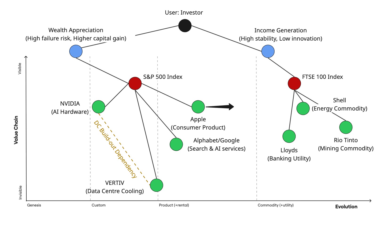
The map illustrates clearly the contrast between stocks in the two indices. Safe & stable FTSE 100 stocks are on the right. More risky and high-potential S&P 500 stocks are on the left.
I was helped to realise the value chain (vertical axis) is from the perspective of an investor who needs to balance growth potential with stability. These ‘user needs’ are represented by the blue circles.
A prudent investor would likely balance their investment in both indices represented by the red circles. This would then expose them to the individual stocks in both indices illustrated by the green circles.
I then dabbled with the idea of showing some relationships between some companies. For example, in order for NVIDIA to provision data centre hardware there’s an indirect demand dependency on data centre build out. This is represented by the gold dashed line linking NVIDIA to VERTIV. VERTIV provides the data centre infrastructure and is innovating in power and cooling.
I could have gone further by adding another gold dashed line linking data centre companies to those providing energy (right side).
At the risk of complicating the map, I illustrated one more consideration. That is the movement of Apple. They’re predominantly a ‘cash cow’ with aspects of lower radical innovation, such as with their iPhone. Therefore, I illustrated it with a black arrow showing them evolving to the right.
I went to bed somewhat satisfied. What do you think?